Smarter, Faster Albie

Albie just got a major upgrade, making your AI assistant more accurate, more helpful, and easier to work with across the platform.

These improvements mean less time clarifying questions and more time getting the answers and insights you actually need — so Albie feels less like a tool you have to wrangle and more like a teammate you can rely on.

  • Refined agent routing and metric selection for more precise responses
  • Improved help and guidance flows so you can find answers faster
  • Cleaner widget draft previews when Albie generates dashboard content
New Achievement Badges

We've added a fun way to celebrate your wins along the way! Power users will now find a fresh set of badges to recognize the contributions that keep their workspace thriving.

New achievement badges like Dashboard Dynamo, Fresh Finds, and Helpful Human turn everyday actions into visible milestones that celebrate your team's progress.

Launch External Resources Directly from Optakit

You can now connect and launch external resources right from the Resources page, bringing your third-party tools into the same workflow as the rest of your platform.

No more juggling browser tabs or hunting for links — your team gets one consistent place to access everything they need, cutting context-switching and getting work started faster.

Smoother, More Reliable Experience Across the Platform

We've rolled out a round of fixes and refinements across billing, landing pages, and help content to keep everything running smoothly.

These updates reduce friction in everyday workflows so you can spend less time troubleshooting and more time getting work done.

  • Improved reliability of billing-related workflows
  • Refined landing page subdomain handling for more predictable behavior
  • Updated in-app help content for clearer guidance

Solidarity Tech is Now a Supported Source

Pull email blast and text blast data from Solidarity Tech directly into Optakit with a native integration — no manual exports required.

Why it matters: get your messaging performance flowing into the same dashboards as the rest of your organizing data, so you can measure cross-channel impact in one view.

Connect Multiple Sheets and ActBlue Accounts on Solo

Teams on supported Solo plans can now connect multiple Google Sheets and ActBlue sources at once, instead of being limited to a single connection per integration.

Solo organizations using multiple sheets or more than one ActBlue account can finally bring all their data into one place without workarounds.

Publish Tools as Reusable Data Tables

You can now publish tool outputs as tables that other workflows and dashboards can pull from directly, turning one-off analyses into reusable data sources across your organization.

Why it matters: stop rebuilding the same logic in multiple places. Publish once, reference everywhere — keeping reporting consistent and saving hours of duplicated setup work.

Reorder Dashboards in the Sidebar

Dashboards in the sidebar can now be reordered so the ones you use most live at the top, exactly where you expect them.

Why it matters: a sidebar that matches how your team actually works cuts down on hunt-and-click time every single day.

Manage Widgets in Bulk

Cleaning up or reorganizing a dashboard used to take dozens of clicks. Now, you can delete, clone, or save multiple dashboard widgets at once instead of repeating the same action one-by-one.

Mass actions turn it into a single decision, saving real time for anyone who maintains large dashboards.

See Who Hasn't Joined Your Workspace Yet

Outstanding invitations are now visible from the workspace, so admins can quickly see who's been invited but hasn't accepted, and follow up or revoke as needed.

Stay in the Loop on Pipeline Health

Pipelines can now send notifications when something needs your attention, giving teams real-time awareness of data flow issues instead of finding out after a dashboard breaks.

Why it matters: faster awareness means faster fixes. No more discovering a stalled sync the morning of a board meeting.

Name Your Dashboards for Easier Navigation

Dashboards now support custom titles, making it easier to organize and find the views that matter most to your team!

No more guessing which dashboard is which — give each one a clear name so collaborators can jump straight to the right place.

Stay in the Loop with What's New

A new "What's New" button is now available on the homepage, giving you quick access to the latest product updates and improvements.

Spend less time hunting through changelogs and more time taking advantage of new capabilities the moment they ship! 🚀

Reorganized Settings for Faster Access

The Settings area has been restructured into clearer sections — Brand, Features, and Security — so you can find and adjust configurations in seconds.

Less clicking around, more time spent on the work that matters. Command search has also been updated to reflect the new layout.

Control How Often Lists Are Tracked

You can now set the tracking frequency for individual lists, giving you direct control over how often each list is refreshed in your pipeline.

Tune high-priority lists for near-real-time updates and dial back the rest — saving processing time and reducing noise on lists that don't change often.

Google Ads Daily Campaigns Data Now Available

A new 'Google Ads Daily Campaigns' data source is now available in the data pipeline, giving you access to daily campaign-level performance data directly within your reporting and analytics workflows.

This addition means you can analyze Google Ads campaign trends over time without leaving the platform — enabling faster, more informed decisions about your ad spend. 📊

More Mock Data Sources Available for Testing

We've added additional mock data sources, giving you more options to explore and test dashboards without needing to connect a live data source.

Whether you're onboarding a new team member, prototyping a dashboard layout, or just experimenting with different widget configurations, the expanded mock sources let you get started faster and iterate without risk. 🚀

Timezone Display Fixes

Timestamps across your sources now consistently reflect the correct timezone tied to your umbrella organization, standardizing the dates and times you see in your tables and reports. 🕐

Smarter Data Usage Monitoring

Optakit now actively monitors your data usage and alerts you when you're approaching your plan's limits, so you're never caught off guard by unexpected overages.

Proactive usage checks mean you can take action — like upgrading or cleaning up old data — before hitting a hard limit that disrupts your workflows. 📊

All Sources Now Unlocked on Every Plan

Every data source is now available on every plan — no add-ons required.

We've simplified our pricing to be usage-based, so what you pay reflects how much you analyze, not which sources you connect. Meta Ads, Google Ads, Scale2Win, and all other sources are fully unlocked across all tiers.

Plans are now defined by analysis limits, making it easier to pick the right tier and know exactly what you're getting.

Split Sources by Account for Cleaner Data Organization

Meta Ads, Google Ads, and Scale2Win now support per-account data sources.

Previously, these connections pulled all your subaccounts into one combined source. Now you can split them out individually — so each account gets its own source, making it easier to build cleaner reports and more targeted dashboards per client.

List Tracking V4 — Smarter, Faster List Intelligence

List Tracking has been upgraded to version 4 with significant improvements to how lists are normalized, cached, and visualized across your dashboards.

  • Improved normalization logic for more accurate list matching
  • Better caching for faster load times when viewing list data
  • Fixed chart color consistency so your list tracking visuals are easier to read at a glance

These changes make list tracking more reliable and performant — so you can trust the data and spend less time waiting for it to load. 📊

Dashboard-Level Widget Update Controls

You now have the ability to control widget data updates at the dashboard level, giving you finer-grained control over when and how your widgets refresh.

This means You can now manage refresh behavior for an entire dashboard in one place — reducing unnecessary data processing and giving you more control over performance outcomes.

Introducing Dynamic Dashboards for Greater Flexibility

No more copy-pasting dashboards for every client.

We've rebuilt Dynamic Dashboards so you can reuse the same layout across different data sources — swap out the source, and your widgets stay exactly as you built them.

  • Choosing and managing your data sources is now simpler with a redesigned selector
  • Source mapping is more intuitive, so each widget pulls from the right place
  • Switching between configurations works consistently, without unexpected behavior

Find Anything Instantly with Global Search

You can now search across your entire Optakit workspace from a single, unified search bar in the top navigation. Whether you're looking for a dashboard, a source, or a setting — just start typing and get there in seconds.

No more clicking through menus to find what you need. Global Search dramatically cuts navigation time so you can stay focused on the work that matters. ⚡

Rich Text on Dashboards

Dashboard text widgets just received a huge feature upgrade and now support all of the most common formatting options. Allowing your organization to not just visualize data beautifully, but to analyze the data beautifully as well.

Meet Albie — Your AI-Powered Analysis Partner

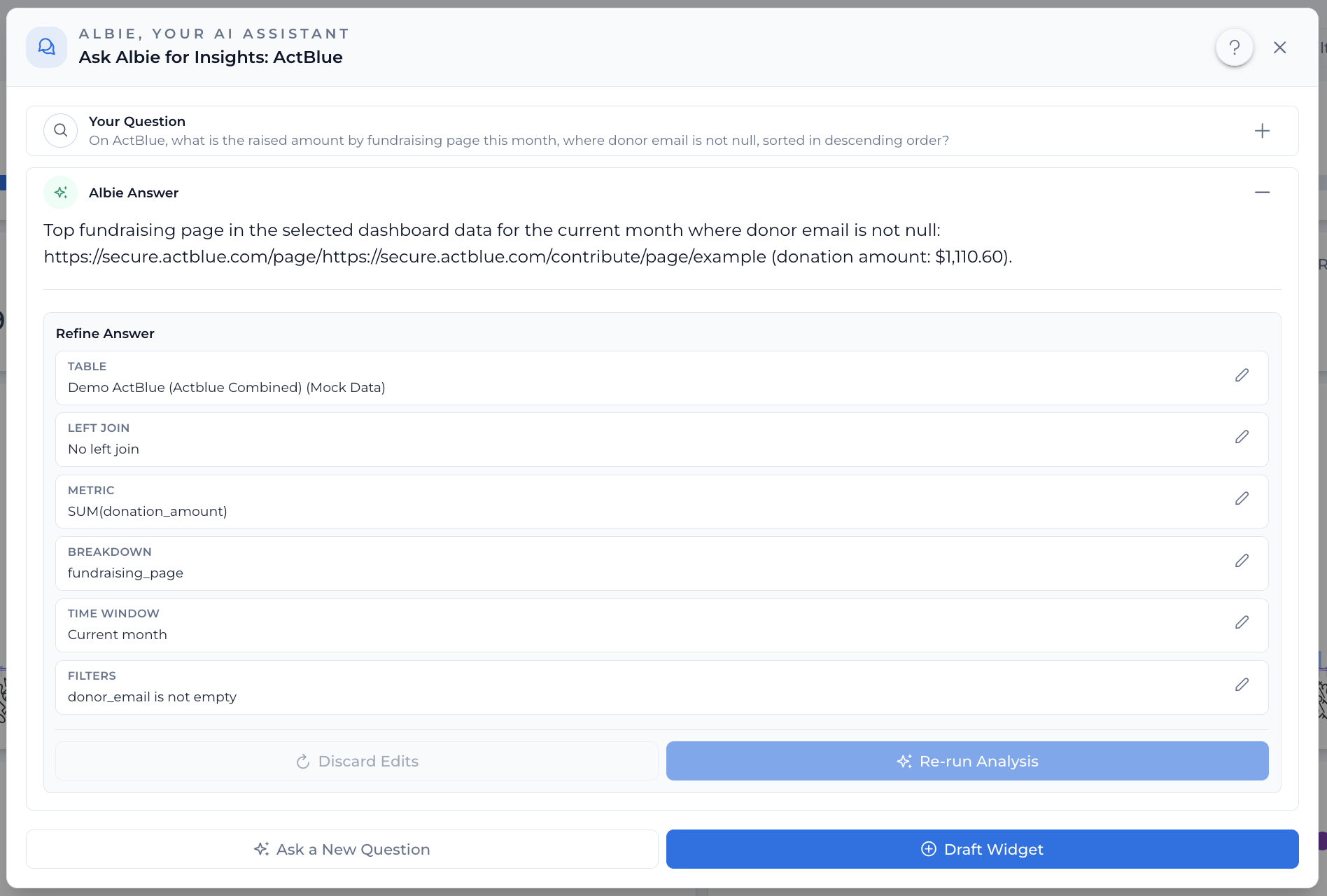
Albie is designed to make it as easy as possible to get answers to your most common questions. Simply ask Albie a question about any source on a dashboard (that you are directly permissioned to) and Albie will try to provide you an answer.

Albie is designed to make it as easy as possible to get answers to your organizations data questions, and will always show exactly how it got to the result that it's responding with. In addition, you can easily draft a widget out of the analysis plan so that you never have to ask Albie the same question twice.

Take Control of Your Pipeline Processing Schedules

You can now update and fine-tune pipeline processing controls directly from the settings, giving you full flexibility over when and how your pipelines run. You can adjust pipeline schedule frequency from your organization's Processing settings page.

Managing pipeline schedules previously required workarounds or support requests. With this update, schedule frequency and processing policies can be adjusted on the fly through the UI.

Display Long Text and URLs in Tables

Tables now support long text fields and clickable URLs, so you can preview and access content without leaving the table view.

Filter by "Last X Days" or "Current Cycle"

You can now filter using Last X Days and Current Cycle time range options, giving you more flexible ways to slice your data without manually picking date ranges.

Similarly, we've added "Current Cycle" as a preset dynamic filter option.

Improved Meta Connection Experience

We updated our Meta Ads connection to more simply show all of the sub-accounts that are currently connected to your Business ID.

We also added more streamlined instructions to make it easier to instruct sub-clients with how they can add their sub-account to your organization's Meta Business ID, and clear instructions for adding your organization's Meta Business ID to ours!

Mailchimp Integration Now Available

We're excited to introduce a brand-new Mailchimp connection! 🎉 You can now pull both campaign-level data and get a domain level data to help with evaluating your program's deliverability performance.

Dashboard Reports - Email and Text

📊 You can now subscribe to scheduled dashboard reports and receive reports directly over email or text. Stay informed with daily automated reports — no need to manually check your dashboards.

  • Subscribe to dashboard reports via the new Report Subscription dialog
  • Automated report generation and delivery on your preferred schedule

New Numero Email Integration

📧 New feature release: You can now connect your Numero Email account as a data source in Optakit! This new integration allows you to ingest and analyze email data from Numero directly within the platform.

  • Full Numero Email data ingestion pipeline with support for key email metrics, including opens, clicks, donations, and other exhaust fields
  • Global API Key support for streamlined authentication
  • dbt models included for automatic data transformation and analysis-ready tables

Revamped Onboarding Experience

🎉 New improvement: We've redesigned the onboarding experience so you can hit the ground running faster than ever!

Setting up your data sources, configuring tasks, and getting your workspace ready is now simpler and smoother, with a clean interface that walks you through each step at your own pace.

New Changelog

Follow along here as we publish new updates! You can track new features as we release them. Want to learn more? Reach out to us!