Ubidots
Low-code application development for the Internet of Things
Boost Your Navigation With Submenus
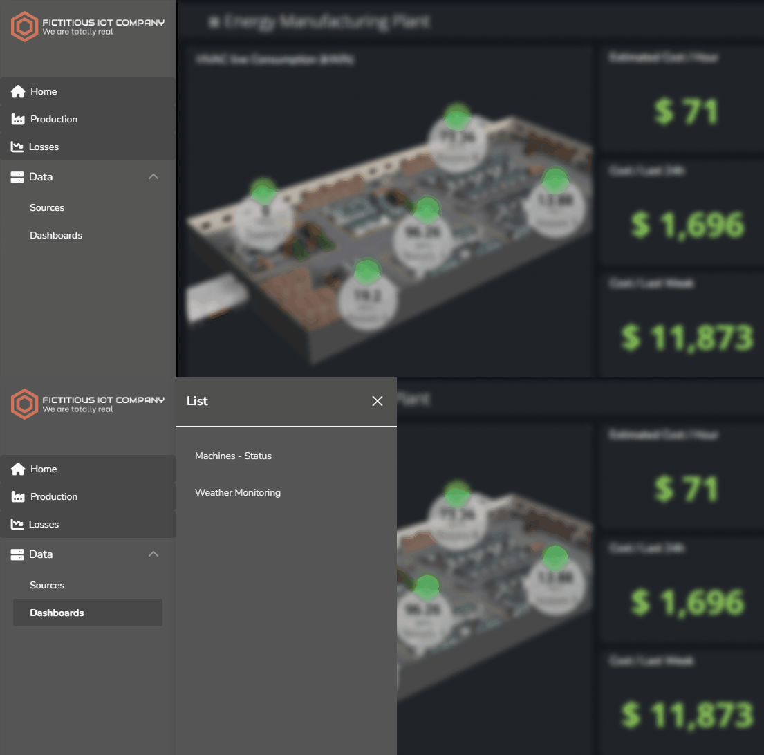
You can now add submenus to the lateral version of the navigation menu, making your app’s navigation even more flexible and organized. These submenus can house additional buttons and be either static or dynamic, giving you the ability to offer fixed content or load user-aware, real-time information directly from an API or UbiFunction. Whether you’re grouping management tools, providing quick access to dashboards, or surfacing external resources, aside panels let you expand your menu without cluttering the main view, creating a smoother and more efficient experience.
Filters in Layers and Public Dashboards
You can now apply filters to specific layers in your dashboards, giving each tab its own tailored data view. This allows you to quickly compare different layers based on their filtered data or just have the flexibility to add filters to one layer instead of the whole dashboard. Additionally, filters are now also displayed in publicly shared dashboards, helping you deliver clearer information to external audiences.
Mobile Layers
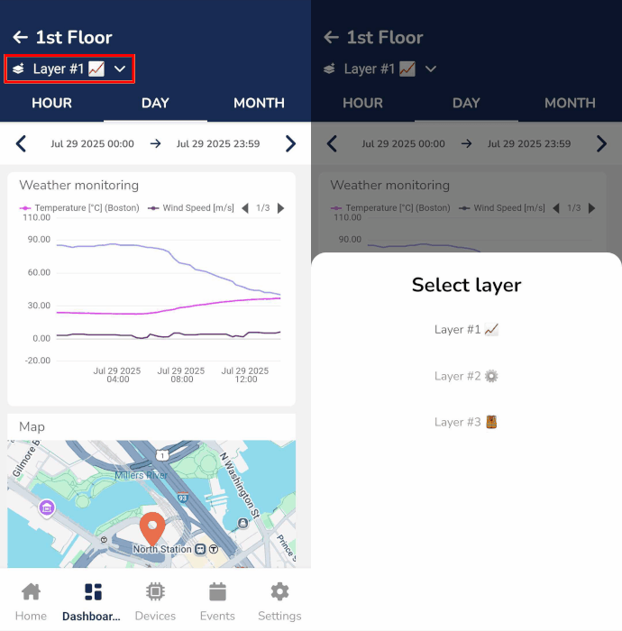
Navigating dashboard Layers is now fully supported in the Ubidots mobile app, giving you seamless access to organized views and operational areas right from your phone. Whether you're on-site or on the move, this improvement helps you switch between layers with ease, keeping your monitoring experience fluid, efficient, and always within reach.
More Configuration Options for Layers
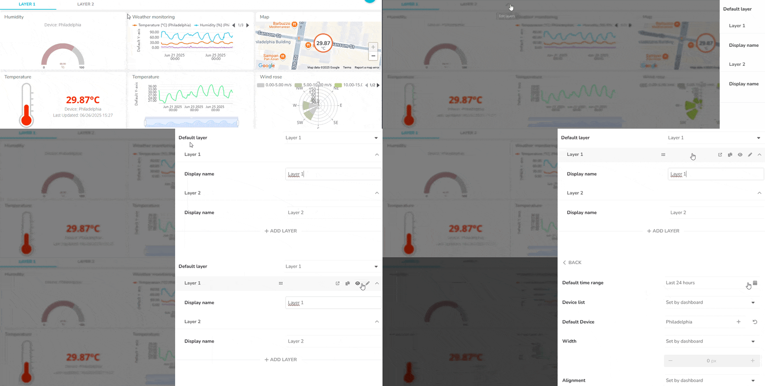
Dashboard Layers now offer even more control, letting you define which devices appear in each layer’s device picker (in dynamic dashboards) and set a default time range for the data displayed. This means you can tailor each layer to show only the most relevant information for your team—whether you're focusing on a specific set of devices or zooming into a precise time window. The result? Smoother navigation, faster insights, and dashboards that adapt to your operational needs.
New Styling Options Make Layers Even More Flexible
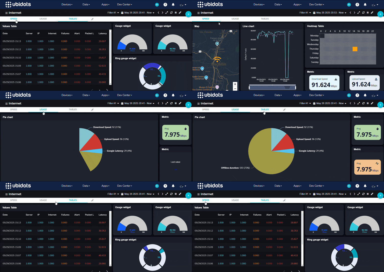
Layers have become a go-to feature for teams managing complex operations. By turning your dashboard into a hub of clickable tabs, Layers let you group related views, device pages, and external tools—all in one place. This keeps your workspace clean, focused, and easy to navigate, helping you stay on top of operations without jumping between dashboards.
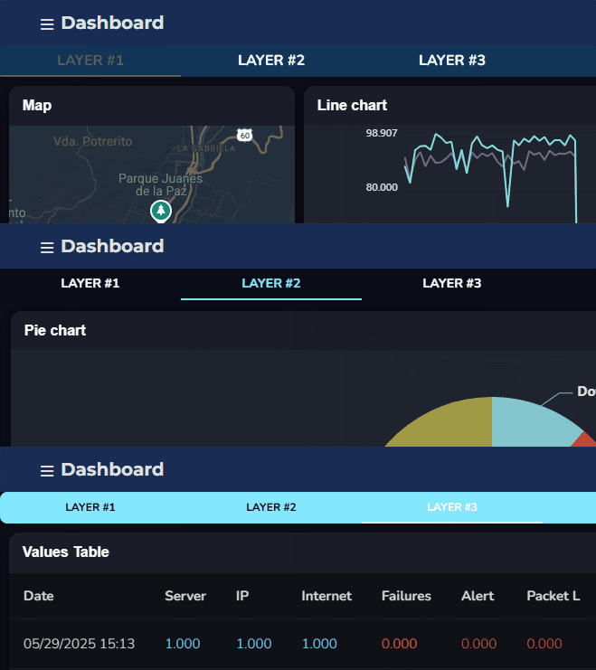
And now we’ve taken it a step further. In response to your feedback—and staying true to our goal of flexibility—you can now style the Layers tab bar to match your brand or visual preferences. Customize colors, font sizes, and even the shape of the tabs to make your dashboards feel more aligned with your team's identity.
Layers, Improved
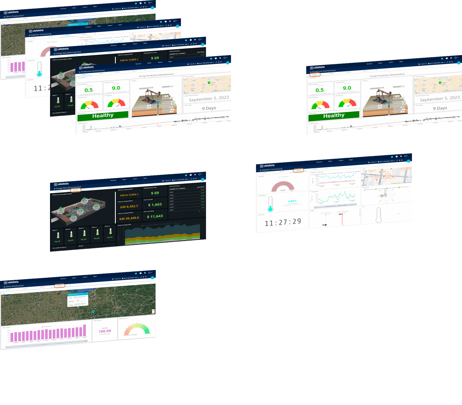
We’ve enhanced our Layers feature to make your workflows even more seamless: you can now duplicate layers with a single click and share them externally. These upgrades simplify the creation of consistent, reusable layouts and make it easier to collaborate with teammates or stakeholders outside of Ubidots. Whether you're building custom dashboards or linking to third-party tools, Layers now offer even greater flexibility and reach.
Pages: Fully Customized Frontend Development
We’re thrilled to announce the new Pages module, where you’ll be able to create custom visualizations to be showcased in your dashboards, using HTML, CSS, and JavaScript. Create stunning pages without leaving Ubidots.
This feature also brings a small but important addition to the platform’s interface: there is now a drop-down menu called Dev Center in the navbar, gathering all development tools under one convenient location. This menu gives quick access to Functions, Pages, and Plugins.
Greater Dashboard Flexibility
We’re excited to announce the introduction of Dashboard Pages, the ability to modify your dashboards with the content of your choice. This allows you to embed external pages in your dashboards, thus increasing their versatility.
Widgets displaying all sorts of data will always be the bread and butter of any Ubidots application, but oftentimes other types of content that are critical to the operation need a place, such as a dashboard, for easy access and greater prominence. This could be anything, from a video that explains how to use the platform, all the way to a third-party application that's important for your operation.
Introducing multi-device dashboards
We’ve introduced a new type of dynamic dashboard that allows you to choose multiple devices to visualize their data simultaneously. This not only increases the amount of data you can monitor, but also makes the process of aggregating multiple data sources easier.
By letting you select up to twelve devices at a time, the multi-device dashboard allows you to easily spot the trends of a whole building or process that’s being monitored by a fleet of devices. Depending on the type of widget (i.e., metric, chart, table, map, etc.) and its configuration, the way the data is represented in this dashboard will vary.
New Feature: Dashboard Filters
Expand your visualization possibilities by applying filters to your dashboard based on variables’ values or context. With filters, your map widget can display only the devices whose latest data was above certain value, or make your metric-type widgets (Bar chart, Battery, Gauge, Indicator, Metric, Tank, Temperature and Variables table) show its last or aggregated values after filtering its data. Filters are now available to all Industrial plan users and above.
One Dashboard to Rule them All
Share the same Dashboard with multiple Organizations
Organizations allow for total independence of each deployment, enabling you to share devices, groups, events, and dashboards to specific customers. By design, each one of these entities could only belong to a single Organization.
With the introduction of Dynamic Dashboards, it became useful to reuse the same dashboard design not only across multiple devices, but also across multiple clients.
It is now possible for a dashboard to belong to multiple Organizations.
Imagine you have 100 clients, each with 100 devices, for a total of 10,000 devices. Given the amount of devices per client, it makes sense to use a Dynamic Dashboard instead of creating one per device. However, creating the same Dashboard 100 times, one for each Org, would be quite time-consuming. Instead, create a single Dynamic Dashboard, and share it with 100 Organizations.
🖱 Adding actions to our values table widget
If I had to create minimal viable product (MVP) for an IoT application, I would build a simple table to log sensor data and display it in a sheet-style format. Well, it is no coincidence that our Values Table Widget has become an essential building block of your IoT applications, ranking #2 in our list of most created widgets. This year alone, you folks created 19,447 table widgets!
As one of your favorites, we decided to give it some love by adding actions so you can decide how a column behaves when clicking, or double clicking on it.
📊 New dashboard features
Custom device names in dropdown list, "Explore data" option, and more.
Explore data option in Widgets
Quickly jump to the underlying variable(s) of a widget with the new "Explore data" option. Just click on the widget options, then "Explore data", then select a variable:
Custom device names in Devices dropdown
You can now customize the list of the devices in a dynamic dashboard. Previously, only device names were supported. Now, you can also use:
- Device name
- Device label
- Device description
This option can be found in the "Settings" drawer of a dynamic Dashboard:
Custom device list in Devices dropdown
Limit the devices displayed in a dynamic dashboard's device list. Previously, all devices were listed by default, which made sense for end-users since only devices belonging to their organization(s) were listed. However, it became important to have the ability to narrow down the list even more, so you can now select from any of these options:
- List all devices
- List only a device type
- List only a device group
This option can be found in the "Settings" drawer of a dynamic Dashboard:
🖼️ A picture is worth a thousand dots
Ubidots widgets are off the charts ?. This month, we're announcing two more options to power your IoT Application.
Image widget
Use image widget to show the actual environment around your connected-objects, explain a concept, or simply inspire your users with the power of a picture. Learn more.
Manual Input widget
Send data points to a variable from the comfort of your dashboard. Yes, you can also set context keys and device properties ?
Understanding circular data with our new Rose Chart Widget
In 1858. statistician and founder of modern nursing, Florence Nightingale, published an article about the Crimean war with a colorful graph that showed how an epidemic disease in the British army was responsible for more deaths than battlefield wounds. This graphic helped explain complex statistics clearly, simply and persuasively, contributing to smarter, more effective care.
Fast forward to today, Nightingale's Rose Chart has become a standard visualization to display stacked columns in a radial aspect. The most common application is perhaps in Meteorology, where it's used to illustrate wind speed and direction. You can now bring this powerful graph to your IoT application in just a few clicks.
👌 Custom style for your Dashboards & Widgets
If your customers love our drag-n-drop dashboards, here's a cherry on top: you'll now be able to come up with your own designs.
Besides Ubidots' customization options at the App branding level, you'll now see a CSS-like editor in dashboards and widgets settings, providing additional options to change their appearance, such as: rounded corners, drop shadows, font color and size, background colors, and more.