Ubidots
Low-code application development for the Internet of Things
Demo Data for Widgets
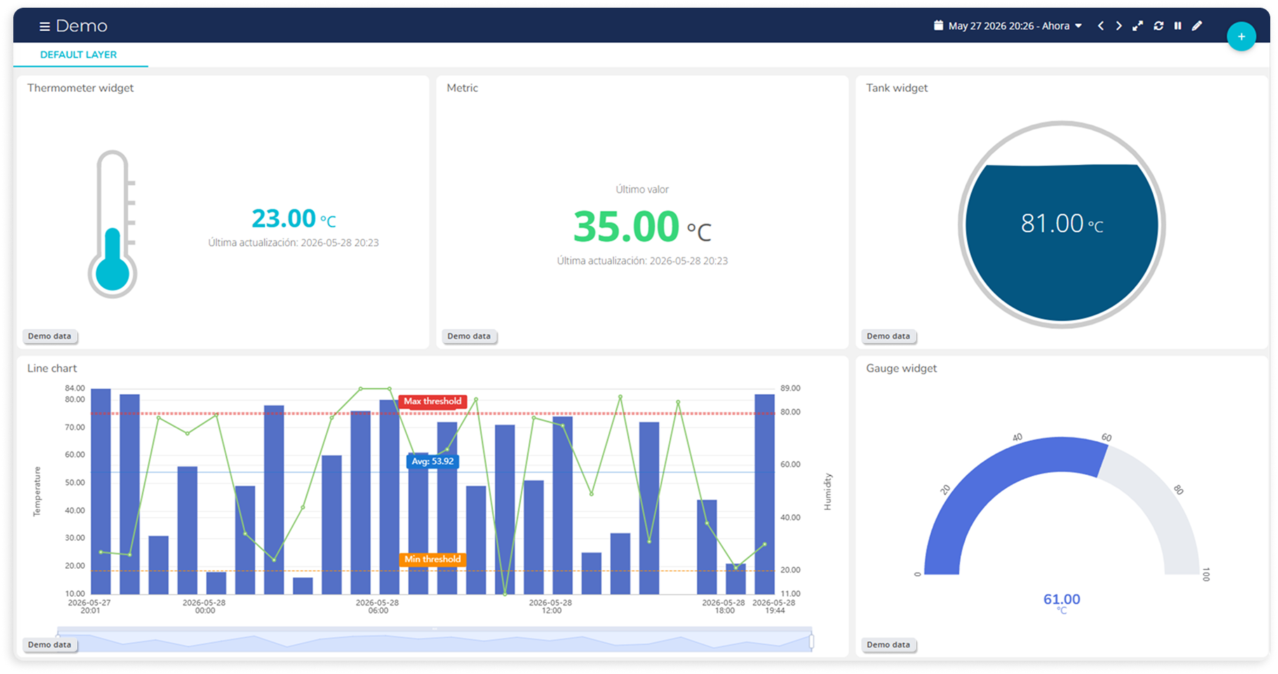
Pitching a solution before the devices are live just got easier. A handful of widgets — Gauge, Metric, Tank, Thermometer, and Line Chart — now support a demo data mode that lets you display simulated readings directly in the widget, without needing real data flowing in. It's a simple but handy tool for showcasing a dashboard to a potential client or stakeholder before the actual deployment is up and running.
Better Line Charts With Context Data
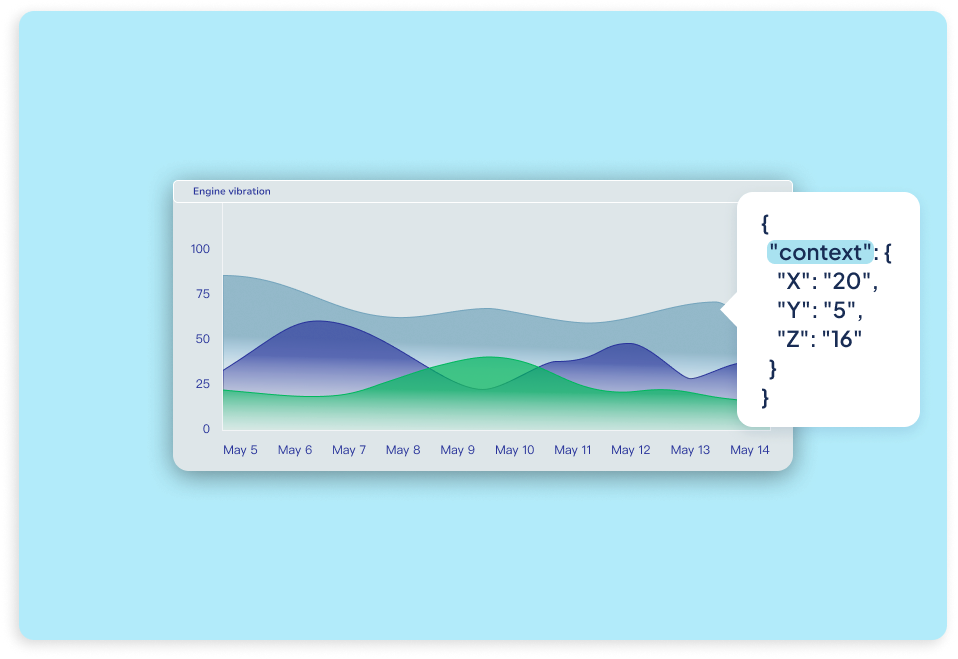
We've improved the Line Chart widget by introducing the option to have it work with context-based data, unlocking new ways to visualize rich, multidimensional measurements. You can now choose whether a line chart works from a variable’s value or from numeric fields stored inside its context, making it ideal for use cases like vibration analysis, frequency monitoring, or any scenario where multiple axes or related metrics are sent together in a single payload. This approach keeps measurements time-aligned, reduces dot usage, and delivers clearer insights without increasing data volume. Regardless of your application, context-aware Line Charts give you more flexibility to represent complex signals accurately, all while keeping dashboards clean, efficient, and easier to interpret.
ECharts for the Gauge Widget
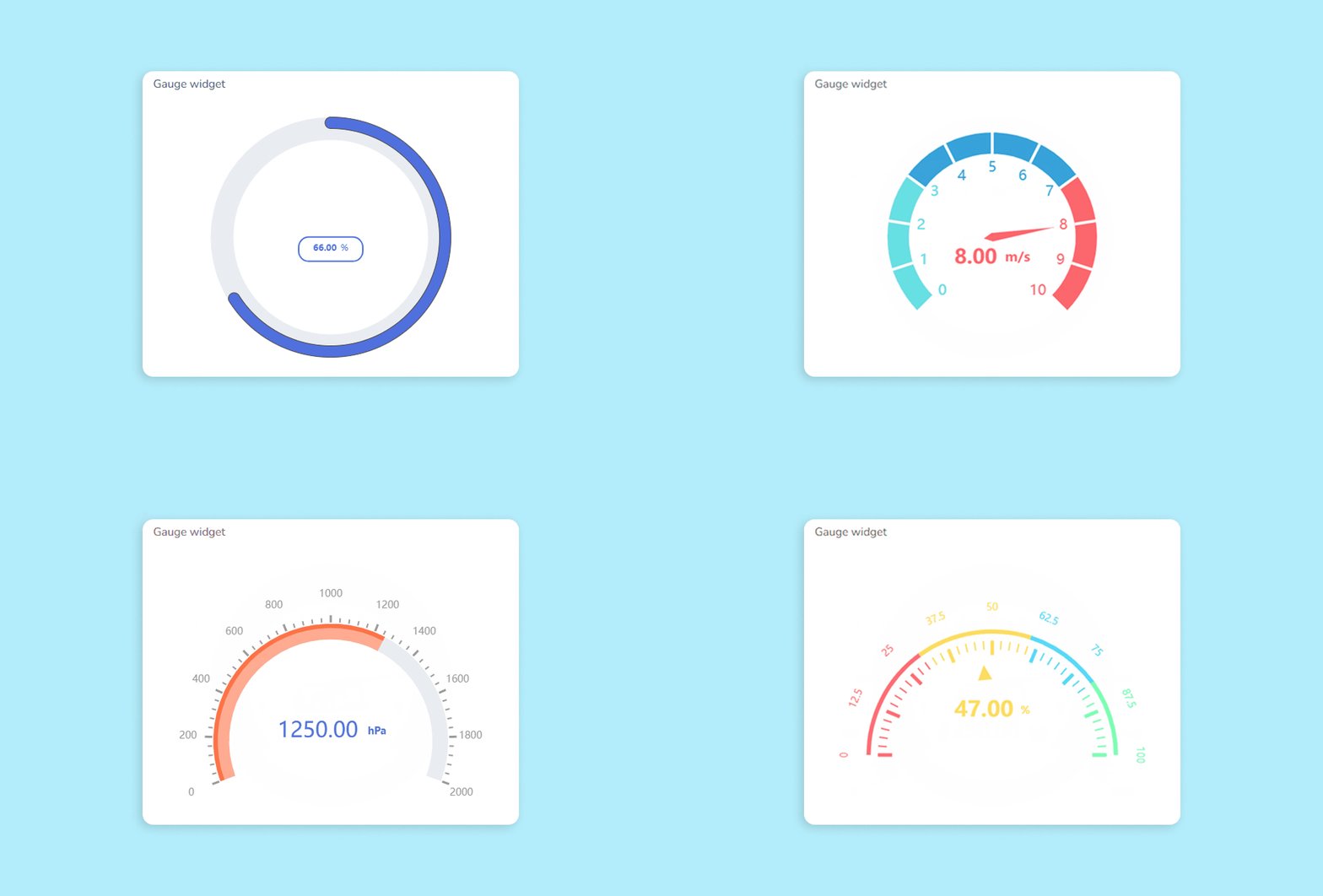
The Gauge widget just became significantly more flexible. It now supports ECharts configuration, unlocking a new level of control over how your gauges look and behave. Beyond the native settings, you can fine-tune visual details like angles, colors, ticks, labels, pointers, and much more to match your application’s design and monitoring needs. No matter your use case, ECharts lets you shape the gauge itself—not just its container—bringing the same advanced customization capabilities already available in Line Charts to one of the most widely used widgets in Ubidots.
Text and Indicator Widgets, Improved
Two of our most traditional widgets, the Text and Indicator widgets, have been upgraded with new options to help you build more dynamic, interactive dashboards. The Text widget now supports clickable actions, allowing you to define what happens when users click or double-click on a message. Redirect users to other dashboards, specific devices, or even external URLs—all from a simple line of text. It’s perfect for guiding users through your dashboard flow or triggering context-aware navigation.
The Indicator widget, often used to monitor binary or threshold-based states, now includes improved layout and design controls. You can customize fonts, sizes, and alignment for each indicator, and choose how they’re arranged—horizontally, vertically, or automatically. These additions give you more precision over how your data is displayed, making it easier to deliver clear, visually consistent indicators that match your application’s design.
Add Notes to Your Line Charts
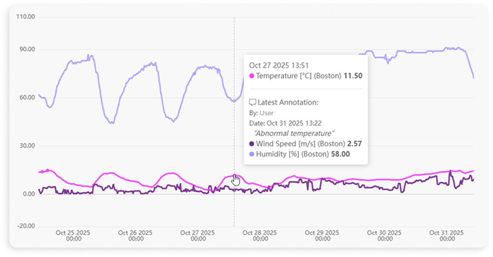
The Line Chart widget now supports annotations, allowing you to add notes directly to specific data points for added clarity and context. Whether you're marking an equipment failure, noting a manual override, or highlighting a spike in readings, these notes can be viewed instantly by hovering over the data point in the chart. It's a simple but powerful way to enrich your time series visuals with real-time insights, making your dashboards more informative and easier to interpret—especially when collaborating across teams.
Duplicate Widgets Across Dashboards
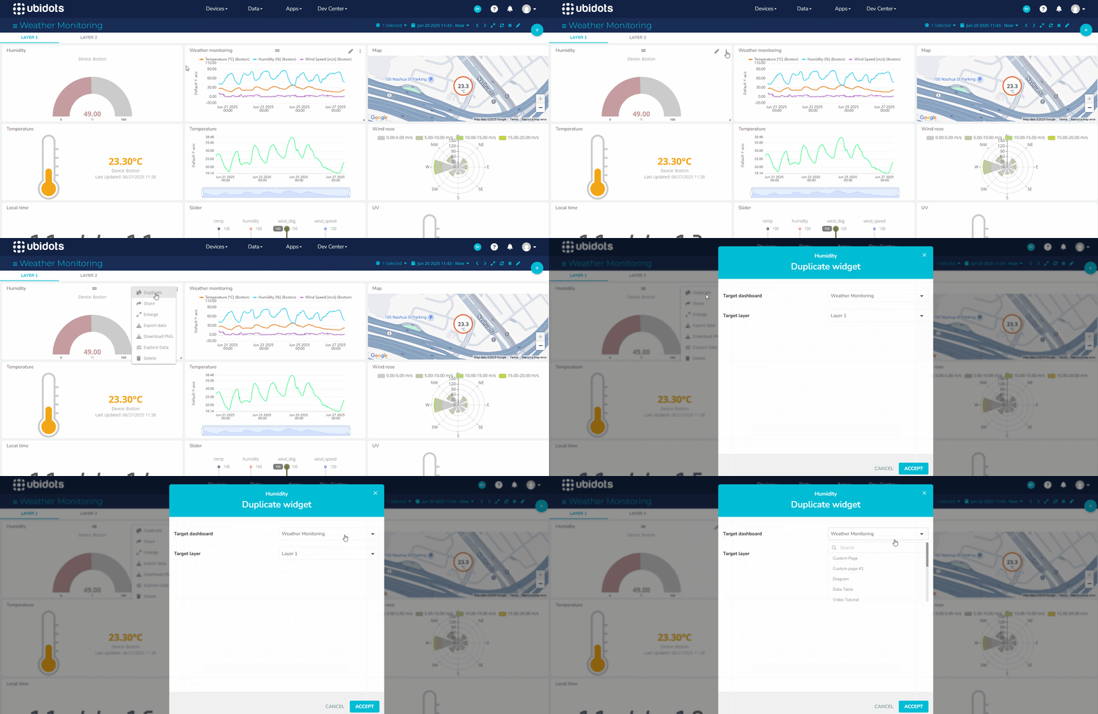
You can now copy widgets across dashboards, making it easier than ever to reuse visualizations throughout your monitoring applications. Whether you're standardizing layouts across clients, creating variations of a dashboard, or building out new views for different teams, this improvement helps you save time and maintain consistency.
Highlight Data Gaps in Your Charts
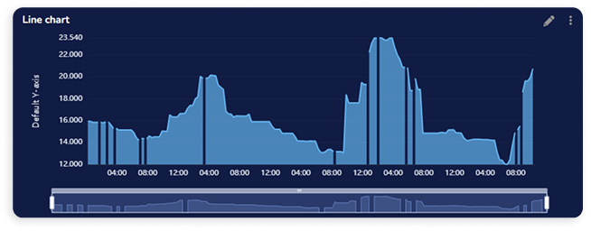
Line charts just got smarter. You can now configure your Line Chart widget to display gaps when no data is received within a set time interval—making data absence as meaningful as its presence. This new option allows you to define, per variable, how many seconds must pass between two data points before a gap is shown. It’s a powerful way to highlight interruptions in your data flow and better understand system behavior over time.
The New Collection Widget Is Here
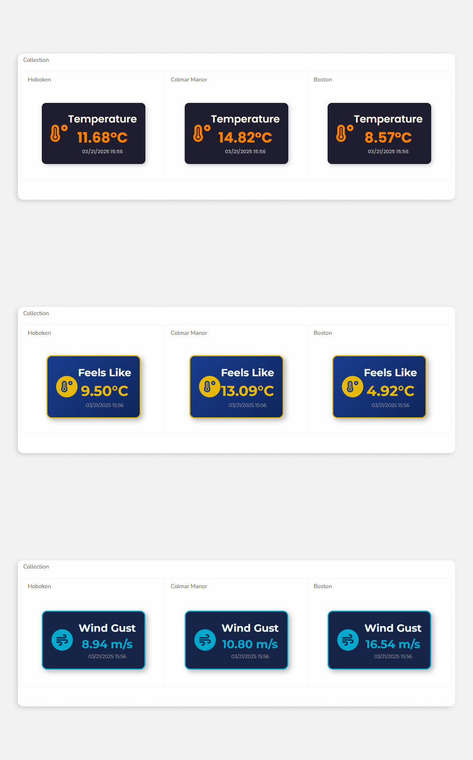
We’re thrilled to introduce the Collection widget, a new addition to the platform that makes data visualization more efficient and consistent. The Collection widget allows you to automatically replicate an existing widget to display data from multiple devices, without having to create each copy manually. Ideal for scenarios like tracking the Overall Equipment Effectiveness (OEE) of every machine in a factory, this feature saves time and ensures uniformity across your dashboards.
Each copy within the Collection widget inherits the original’s style, color logic, and configuration, maintaining a consistent visual experience. Say goodbye to repetitive widget creation and enjoy a smoother, more automated visualization process.
Introducing the New Line Chart
The Line Chart widget has just been reinvigorated with a fresh look and two new features to expand its functionality and flexibility: ECharts and Hover Group.
The first new feature, ECharts, is a powerful open-source visualization library designed to create interactive and customizable charts. This new configuration option provides extensive customization options, allowing you to tailor the appearance and behavior of charts to fit specific requirements.
On the other hand, Hover Group is a configuration option that allows you to connect Line Charts in a dashboard so that their tooltips and pointers become synchronized when hovering over them.
New Bar Chart Features
The Bar Chart widget has been enhanced with two new visualization options. The first one allows you to sort the bars in an ascending or descending way according to their values. The other one gives you the option of dynamically “highlighting” the largest bars with the color of your choice.
Text widget, improved
Text widgets, a handy tool to display important messages on your dashboards or to even explain the data of other widgets, are now even better than before thanks to the inclusion of more native styling options.
You can now easily enhance your messages with the following options:
- Bold
- Italic
- Underline
- Or by changing the opacity of the font's color
Color logic for the metric widgets
Our family of metric widgets has been a staple group of tools that have enabled thousands of projects and operations for years and we’re now happy to announce that they have been improved based on your feedback.
Now, it’s possible to not only define a fixed background color for your metric-type widgets, but to even set up a color logic that changes their background based on your data. This facilitates data visualization and gives you greater flexibility to style and set up your dashboards according to your needs.
Custom UI, boosted
The Custom UI widget, in which you can mix UI components at will in order to build your own interface, is now even more robust thanks to the addition of 4 new components you can use in your widget:
- Toggle button
- Dropdown menu (of single or multiple choice)
- Hour picker
- Numeric input
Once the Custom UI is configured, you can trigger a webhook to an UbiFunction or 3rd-party platform to process the input data — or just go to another Ubidots dashboard or an external link. It can be used for many solutions, such as the following:
- A truck driver who inputs data in a smartphone about incidents along the route. This data enriches the GPS data already collected in Ubidots.
- A machine expert who just finished a maintenance task and leaves the maintenance date with comments in a tablet located next to the machine.
- An IoT-fleet operator who sets configuration parameters and triggers a downlink function when hitting “send”.
Go to variable
You can now easily navigate to the page of any variable linked to a widget by using the “go to variable” button in the widget’s settings.
Introducing the new Incidents widget
We’re excited to announce that our Incidents widget has gone through a major revamp and is now ready to track all your events. But what is the Incidents widget and what does it do? It’s a table-type widget that allows you to keep a detailed record of each of your events, including their trigger time, trigger value, resolution status, and more.
The Incidents widget allows you to not only further centralize your operation in the dashboard, but also to add comments to the events, resulting in complete tracking from when the event activates to its resolution.
React for the HTML Canvas
We’ve introduced the ability to use React.js in the HTML Canvas widget, giving you access to a front-end development powerhouse. React is a popular, open-source JavaScript library developed and maintained by Facebook. It serves as the foundation for creating modern and robust user interfaces for web and mobile applications.
Enabling it is as easy as toggling a button in the widget’s configuration and the widget will function as it always has, except one of the tabs in the code editor will now be devoted to React.
Control Widgets, Improved
Our control widgets (Switch, Slider, and Manual Input) have just been improved with a new feature that allows you to identify the user that operated the widget. Given the critical role control widgets usually play, it’s equally important to monitor their correct use to better understand processes and make timely corrections according to observations.
By simply activating a button in the widget’s configuration, the information of the user who operates it will be logged into the context of the variable that’s being controlled with the widget. That information can then be easily checked directly in the variable’s page or in another widget that displays that context data such as a Values Table.
New widget: Runtime
Information such as the total active time of a machine, whether it's performing up to its potential or not, and how long it’s been running since its last maintenance, are all key to improve an operation and to get a better picture on metrics such as OEE.
With our new Runtime widget you’ll be able to effortlessly monitor how long your devices have been active within a specified timeframe, allowing you to identify trends and make data-driven decisions.
More Value for Your Tables
Data ordered in columns and rows… The simplicity of the Values Table widget has made it a consistent favorite among Ubidots users since its launch, a fact that motivates us to keep improving it. Here are the latest novelties for the Values Table widget:
- Adding values manually: You can now introduce any number of new values into existing columns of your Values Tables.
- Alternating row colors: To expand the customization options of this widget and enhance its readability, you can now pick one or two colors for the rows of your Values Tables to alternate between.
Whether it’s to keep track of the output of a machine or to store any data that has to be logged manually, the Values Table gives you full control over your data by allowing you to add and edit values at will.
Introducing the Custom UI Widget
We’re excited about our latest addition to Ubidots Advanced Widgets: the Custom UI - the Swiss-army knife of all widgets. It allows you to mix UI components at will, in order to build your own interface using:
- Text labels
- Numeric inputs
- Text inputs
- Date inputs
- Buttons
- … And more in the future!
Once configured, you can trigger a webhook to an UbiFunction or 3rd-party platform to process the input data — or just go to another Ubidots dashboard or an external link.
Custom UI's (historically made by hand, using our HTML canvas widget) have been at the center of many of your IoT applications. Here a few examples:
- A truck driver who inputs data in a smartphone about incidents along the route. This data enriches the GPS data already collected in Ubidots.
- A machine expert who just finished a maintenance task and leaves the maintenance date with comments in a tablet located next to the machine.
- An IoT-fleet operator who sets configuration parameters and triggers a downlink function when hitting “Send”.
Add new rows to values tables
Being one of our oldest and most popular widgets, the Values Table deserved some love. However, we didn’t want the change to be just aesthetic, but also functional. That’s why other than encountering a widget that’s on par with the design changes we’ve been progressively introducing to the platform, you’ll also get to use a Values Table that allows you to edit and introduce values at will.
This change, in addition to all the features you already loved about the Values Table, increases the control and possibilities you have over your operation. Whether it’s to keep track of the output of a machine or to store any data that has to be logged manually, the new Values Table will be your favorite tool.
New Widget: SCADA
Industries like water management, manufacturing, or energy have relied on SCADA systems for decades to improve efficiency and control operations. If you’ve worked in industries like these or with equipment like PLCs, chances are you’ve come across the famous SCADA visualizations.
Mixing industry standards with our flexibility and ease of use, it’s now possible to have those visualizations in Ubidots thanks to our new SCADA widget! With it, you’ll be able to create them without purchasing expensive software or spending hundreds of valuable hours coding.
Using an editor entirely devoted to this widget, you’ll be able to design schematics that work and look like the famous SCADA systems visualizations, which use standard engineering symbology and with which it’s possible to intuitable arrange an entire operation into one comprehensive image.
The SCADA widget is available to Industrial plans and above. If your plan is below Industrial, but would like to try this widget, let us know.
New Widget: The Frequency Chart
Our catalog of widgets keeps growing with this month’s introduction of the Frequency Chart widget. This widget enables tasks such as vibration analysis for machinery diagnosis by allowing you to plot data frames at high sampling rates more efficiently.
Let’s say we have an electrocardiogram (ECG) application that is taking samples at a rate of 60 Hz. Plotting these data in a line chart, for example, would have required streaming 60 dots per second, which is well above our API rate limits. Instead, you can now store 1 dot per second and 60 readings inside the context of that dot, and then use the Frequency Chart widget.
This widget is available to Industrial plan holders and above.
New Widget: The Heatmap Table
No one wants to feel the heat, but what about seeing it? We are introducing a new widget that lets you do just that: the Heatmap Table. Select a variable and a color logic and you’ll have a convenient overview of weeks or months’ worth of data. It allows you to simplify complex data into visualizations that can be easily understood and identified.
Few things are as eloquent as seeing a bunch of blue, calming squares and, in between them, an alerting, solitary red square sticking out like a sore thumb. Regardless of the industry (such as oil and gas as prime examples), it immediately provides you with all the information you need — something is wrong and must be fixed. We hope nothing like this happens to you, but if it does, better have a Heatmap at hand! This widget is available to all Industrial and Enterprise plan holders.
Introducing Map Zones
Our map widget keeps improving! In the previous newsletter we shared how it was now possible to display a dashboard over it, and today we’re introducing yet another function: the ability to plot a zone on the map, and associate it with a Device Group.
A zone is a defined area within the map that visually encloses the devices in a marker group. Zones act as a second layer that sits on top of the map and can be of a fixed color or color-react based on either a fixed variable value or a zone metric. They can compute metrics across variables in the marker group’s devices or even act upon actions such as click or double click — giving you not only visual feedback about your fleet, but also allowing you to interact with the widget.
If You Like Your Dashboard, Put a Ring on It
New Widget: The Ring Gauge
Our catalog of available widgets has just gotten bigger with the addition of a new ring gauge that’s all about convenience: it gives you the opportunity to display the current value of up to four different variables. As for its settings, you can independently define the aggregation method and color logic for each variable.
This widget is particularly useful for variables that are related, as would be the case, for example, of a solar energy solution where 4 key variables would be monitored: energy generated, the charge of the batteries, the electric current, and the overall consumption.
Timestamp in Manual Input
Hypothetical case: A production plant needs to log production values at the end of the shift with a specific, manually chosen timestamp. Previously, the timestamp was automatically generated when the data was logged, but it’s now possible to do it manually.
New Map Action: Display Dashboard
You can now set up a map action that allows you to load a dashboard on top of the map as a pop-up. With just one or two clicks, you’ll be able to access all the relevant information of your dashboard without having to switch between tabs or click away.